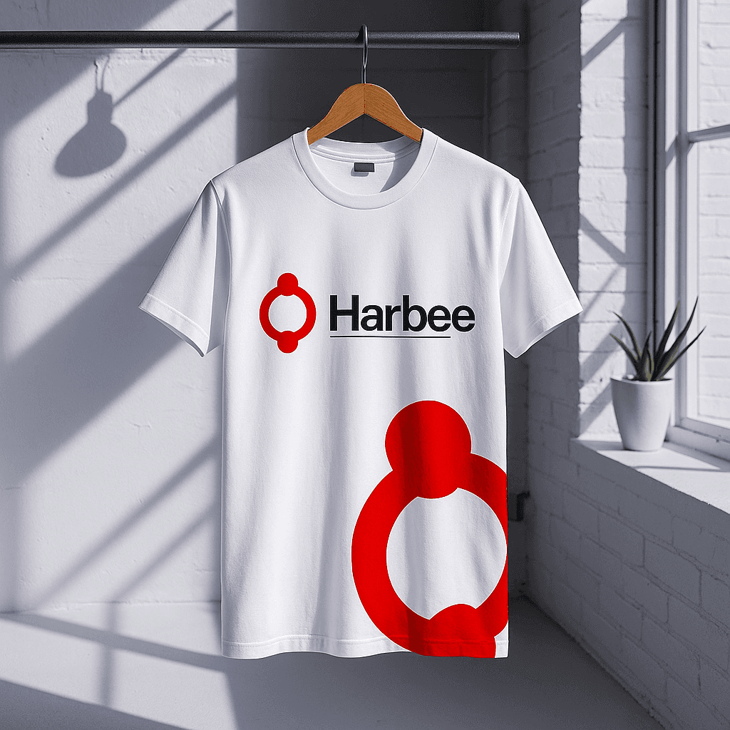
Harbee Brand Idenity
Harbee is a grassroots organization focused on empowering communities through collaboration, learning, and shared progress. I was brought on board to lead the development of their full brand identity system, from visual direction and logo design to branded merchandise and event setups.
Client
Harbee
Service Provided
Brand Identity Design. Visual Strategy, Event Collateral Design
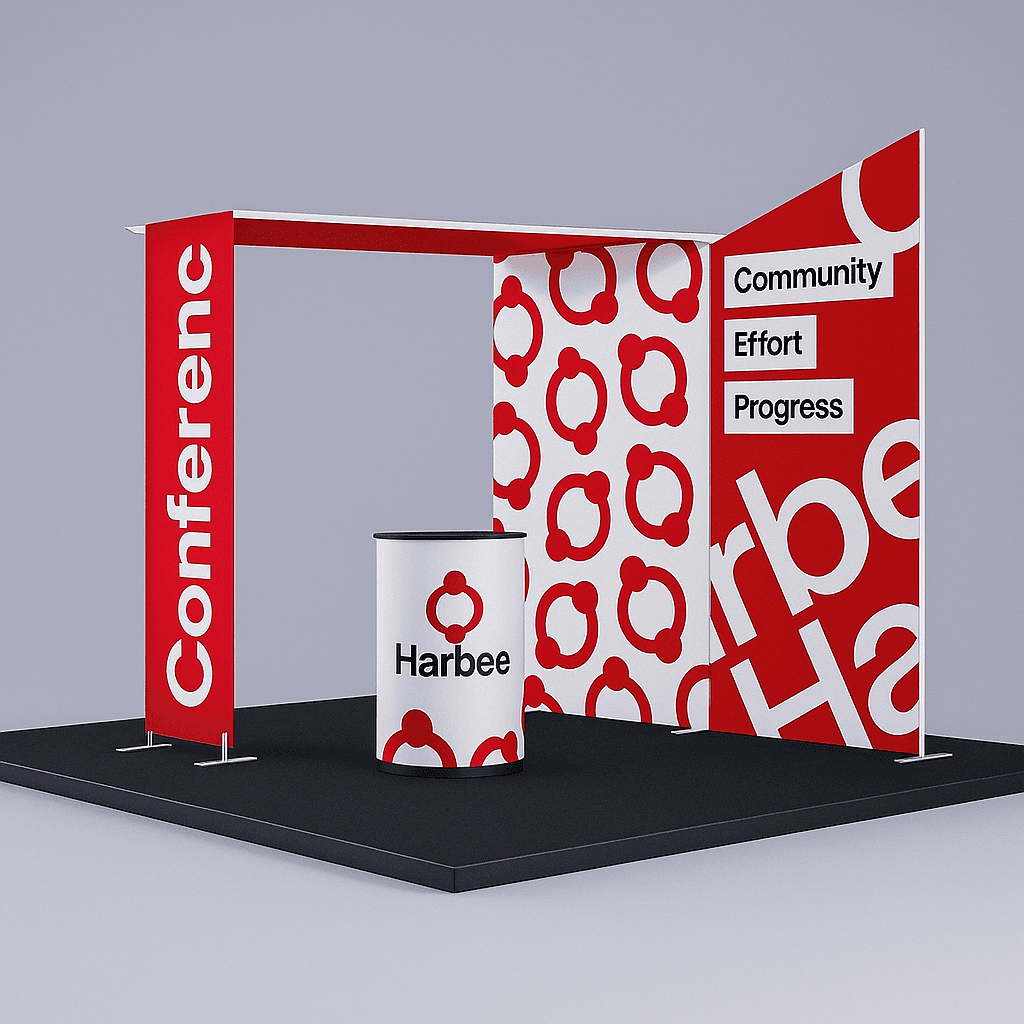
The Goal: Translating Mission to Visual Identity
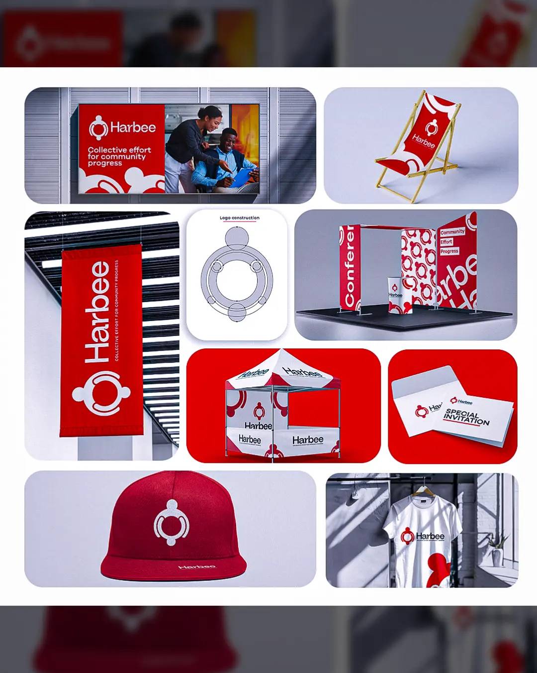
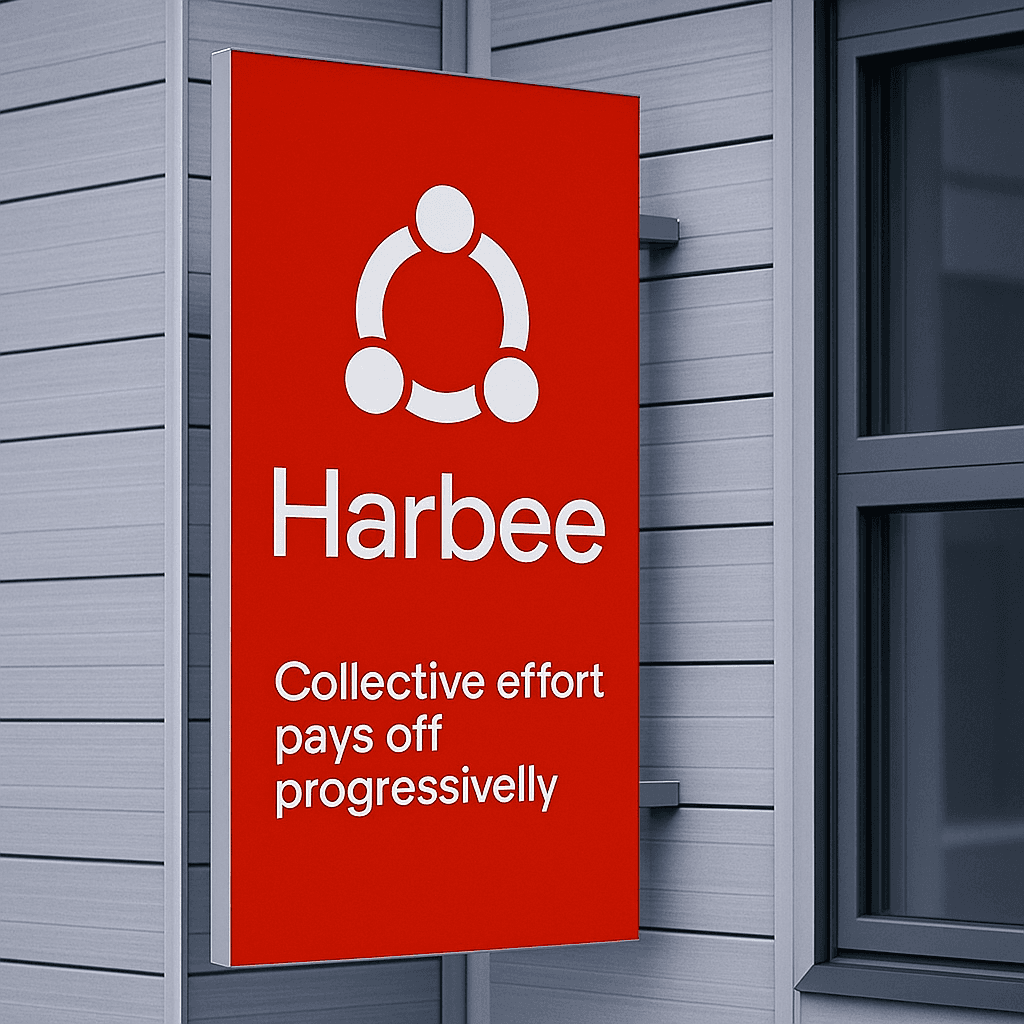
Harbee's mantra- ''Collective effort for community progress''- became the foundation for the entire design system. I started by crafting a logo that visually represented people connected in a circle, symbolizing equality, collaboration, and growth. The structure of the icon is clean and geometric, ensuring it scales well in all sizes and mediums. We selected a bold red color as the primary palette, one that captures energy, urgweny and warmth. This was supported by minilaist typography andf intentional white spaces to keep the viuslas modern, clean and clear.
1
The Challenge: Bringing the Brand to Life Across Touchpoints
After finalizing the identity, I worked on rolling it out across physicall and digital assests. this included community tents, promotional flags, T-shirts, caps, venmt booths, printed initations, and branded lounge itemslike chairs. Every item was crafted to mainatin high visibility and communicate Harbee's values instatntly in any enviroment.
2
The Result: designing for Real Impact
This project was about building a system that works in rela world contexts. From empowering volunteers through branded wearables to attracting attention at community outreach events, the identity works to support Harbee's mission everyday. Design here played a key role in helping the organization move from concept to presence allowing Harbee to feel united, mission-driven, ready to scale.
3